Corporate Design for the short trip platform Auszeit Momente

Comprehensive design for tourism and the hotel industry

Auszeit-Momente is a platform for finding short trips in the local area, combined with a print magazine that showcases hotels and regions.

When looking for a spontaneous break from everyday life without long journeys, it can be difficult to see the wood for the trees. If only there were a well-thought-out solution that curates hotels, regions and special offers, inspires and makes searching for and booking short trips an exciting experience.

We delivered the right brand identity and a holistic concept that invites discovery and dreams — from the website to B2B and B2C communication to the customer magazine. Your next travel adventure? Just a stone’s throw away.t.

Client
Rheinland Tourismus GmbH

Industry
Tourism & Hotels
B2C & B2B Marketing for hotels and destinations

Services

  • Brand developement & Corporate Design
  • Webdesign & UX/UI
  • Editorial Design
  • Crossmedia communication
  • B2B-materials

The task:
Brand loyalty across all channels

Our task was to develop a brand that optimally conveys the concept of spontaneous short breaks in the immediate vicinity and to shape the Auszeit-Momente brand into a holistic world of experience across all channels.

Our goal:
To make the user experience on the Auszeit website and in the accompanying magazine as intuitive as possible, while whetting the appetite for the next short trip.

Our solution:
A cross-media experience

The Auszeit cat carries the key to the next short break – and it’s always ‘a cat’s jump away’, which is the german proverb for ‘just a stone’s throw away’. With this new slogan and a corporate design tailored to the target group, we have packaged Auszeit moments into a compelling brand world that inspires trust, curiosity and a desire for holidays.

Time out logo with cat and key in white/transparent

A cats jump away

Corporate Design

Reach your destination easily with your cat and keys

When we were entrusted with developing the brand, the beautiful name Auszeit-Momente (Time-Out Moments) and the promising business concept already existed. After the initial discussions, the slogan ‘Nur einen Katzensprung entfernt’ (Just a stone’s throw away in the german version) quickly emerged. It perfectly sums up the core idea of taking time out close to home and spontaneity.

This promise is also reflected in the logo: the jumping cat with the golden key stands for flexibility, the joy of discovery and the opportunity to constantly explore new destinations close by.

Time out logo with cat and key, white on anthracite
Logo Time Out dark on gold
sample text aA in corporate fonts

Momente Mint #8CCAAE

Slate Grey #3C3C3B

Auszeit Gold #BB9B58

Corporate Illustration
Illustrated Time-Out Map

As part of the brand world, corporate illustration is not only functional, but also contributes to emotional brand loyalty. The effect is particularly evident on the illustrated map, which is part of the tourism magazine.

For moments of respite, we have developed a brand experience with a wanderlust factor.

Open page of the magazine, picture of the Moselle and information about the region

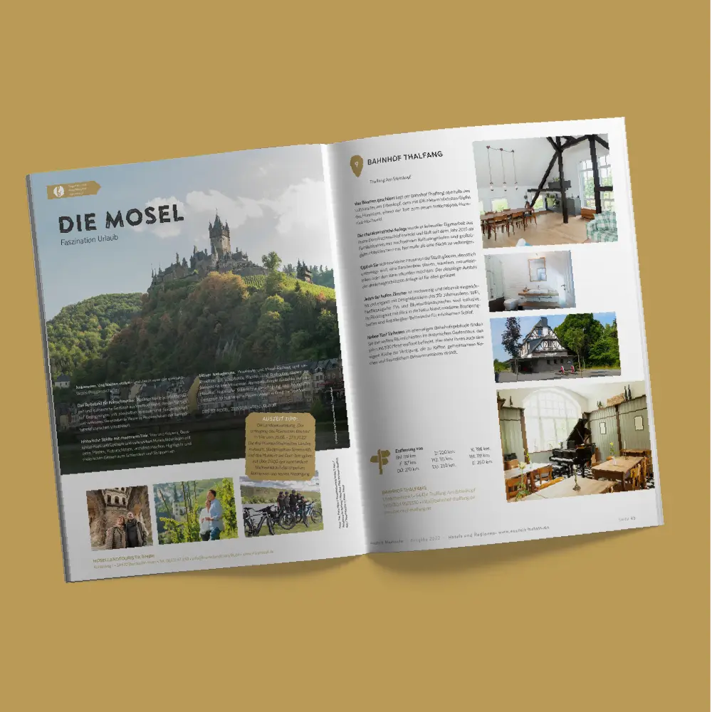
Digital and print magazine ‘Auszeit-Momente’ (Time Out Moments)
Browse and be inspired

The magazine, featuring selected photos, exciting interviews and practical leisure and holiday tips, is published regularly in print and online. Hotels and regions are presented in a clear and atmospheric way.

Mobile phone with the Auszeit website homepage

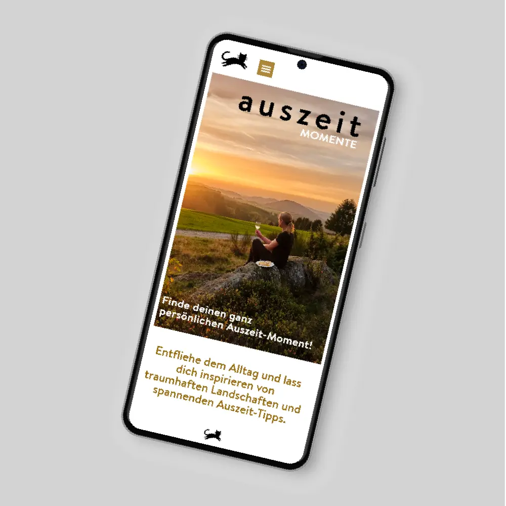
Auszeit Responsive Website
Intuitive search and host discovery

Just a stone’s throw away: At its heart is an innovative search mask that filters short breaks and excursions in the surrounding area by theme and landscape type and suggests trips based on personal interests.

Time Out Wall Calendar
Customer gift with a focus on added value

The Auszeit wall calendar provides inspiration for short breaks throughout the year – with its practical use, the calendar is a giveaway with real added value.

Corporate Illustration for the German Nutrition Society (Deutsche Gesellschaft für Ernährung/DGE)

Infographics for scientific communication

The German Nutrition Society (DGE) is a leading institution in the field of nutrition science and consulting in Germany.

Illustrations are far more than just decorative embellishments – they play a crucial role in making complex content tangible and understandable. Especially in science, where content must be conveyed precisely and uniformly, a well-thought-out visual language plays a significant role. For the German Nutrition Society (DGE), we have created exactly that: an illustration system that not only strengthens the organization’s identity but also serves as an overarching tool ensuring clear and consistent communication.

Client
German Nutrition Society (DGE)

Industry
Nutrition Science, Healthcare, Public Institution

Services

  • Development of a consistent corporate illustration
  • Creation of a modular illustration library
  • Scalable illustration solutions

The Task:
Consistency without creative limitations

Previously, the illustration style in DGE publications was inconsistent. The goal was therefore to develop a look that perfectly integrates into the existing corporate design. At the same time, the new illustration system needed to be flexible enough to easily integrate future topics and be intuitively usable by both internal and external designers.

Striking a balance between standardization and creative freedom was one of the biggest challenges. The new style had to be precise, factual, yet appealing – a visual language that works in scientific publications as well as in infographics and digital media. Furthermore, it needed to offer enough scope for expansion when necessary, without diluting the overall image.

Our Solution:
An intuitively usable, modular illustration toolkit

The result is a comprehensive, modular illustration library that visually supports central nutrition topics – from fruits and vegetables to various food groups and everyday scenes with people. The illustrations follow a clear, reduced visual language and a color palette that harmoniously integrates into the DGE corporate design.

Thanks to their modular structure, the illustrations can be combined and expanded in various ways, making them suitable for a wide range of applications. The simplified illustrations follow a scheme that makes it easy for external graphic design agencies to independently add new graphics if needed.

Instead of developing individual illustrations, a wide selection of elements is now available that can be used quickly and efficiently.

Example of Representation:
Temperature levels of a cooking pot

This example illustrates how color scheme, simplified shapes, and simple, intuitive symbols are combined to make complex facts understandable and graspable at a glance.

Corporate Illustration for DGE (German Nutrition Society): Construction guide and proportions for people based on a woman and a man. The woman has brown hair, a medium blue sweater, and light blue pants. She is carrying a coffee cup. The man has black hair, a red sweater, and dark blue pants. He is carrying a basket of vegetables.

Flexible scheme for the representation of people

In addition to the food elements, we developed a flexible scheme for illustrating people. This scheme allows for quick and easy creation of individual figures without deviating from the consistent style.

Corporate Illustration for DGE (German Nutrition Society) Infographics: A diverse group of people (older, younger, various body types, various skin colors, various genders)

Application: Illustrations in Use

Our illustrations have already been successfully used in numerous infographics and publications by the DGE. Whether it’s about infographics, decorative elements, or illustrating recommendations for specific target groups – the illustrations ensure clarity, recognition, and above all, a visually appealing presentation of the content.

General usages of corporate illustrations:

Press Releases
For visual support of topics and study results.

Social Media
Graphics for Facebook, Instagram, LinkedIn, X, and Pinterest.

Infographics
For explaining complex topics in a clear and understandable way.

Mailings
For visual enhancement and improved readability of content.

Website
Header banners, blog posts, landing pages, and interactive elements.

Print Publications
Brochures, flyers, and magazines.

Guidelines and Reports
Illustrations to support guidelines and scientific publications.

Posters and Banners
For events or campaigns with a consistent visual language.

Presentations
Visual support for lectures and internal training.

Fairs and Events
Roll-ups, banners, and other promotional materials for on-site use.

Video Animations
For explainer videos or animated infographics.